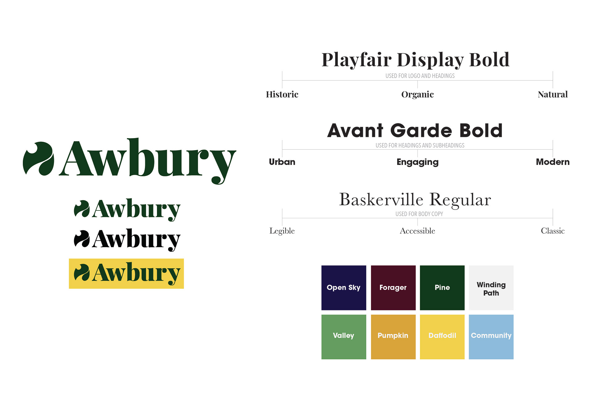
Awbury Arboretum is a public park and nature area that prides itself on being open to the public in an otherwise urban environment. This rebrand utilized texture and positive and negative space to create the logo and other brand collateral. The color palette was chosen to stand out in an urban setting, but still feel natural and true to the arboretum. Similar thought was put into the typography choices. The use of Playfair and Baskerville as more natural typefaces, but using Avant Garde to contrast and feel more modern.
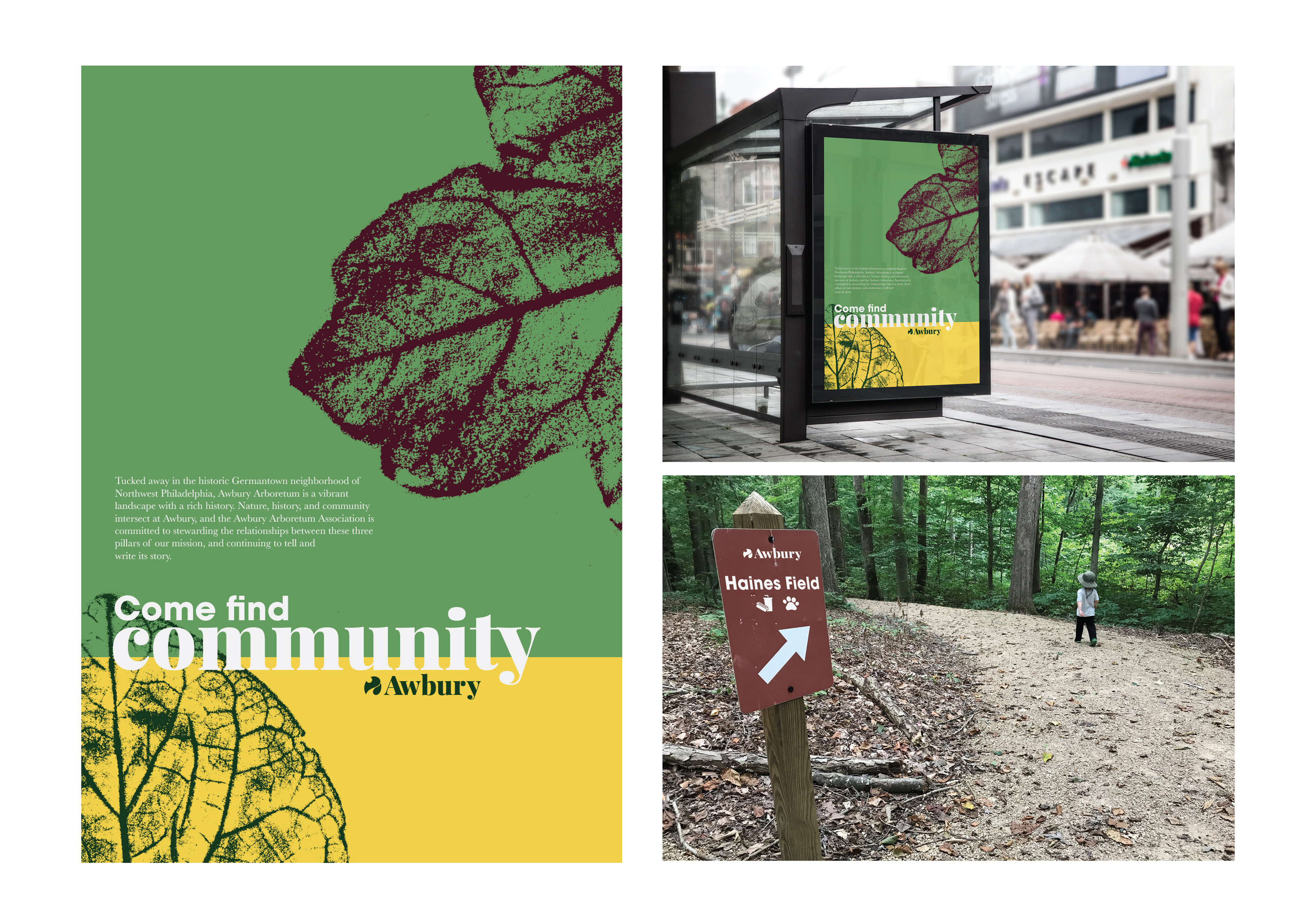
Within the applications, signage became a large focus both inside and outside of the arboretum. For marketing signage, I used leaf rubbings to add texture and interest while enforcing the grid system in place. However, inside of the arboretum, the logo is able to stand alone as an accent.
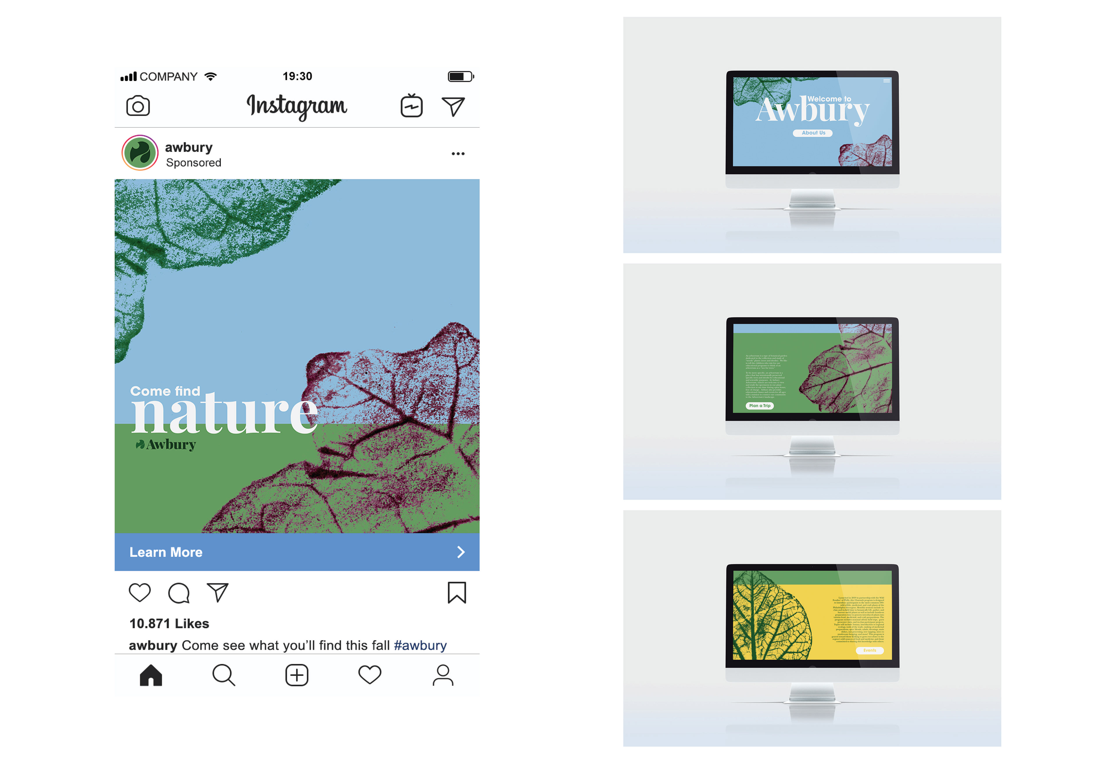
Similar treatment was used for digital marketing and web design. Allowing the bold colors and texture to invite people in while still providing necessary information.